Uniview
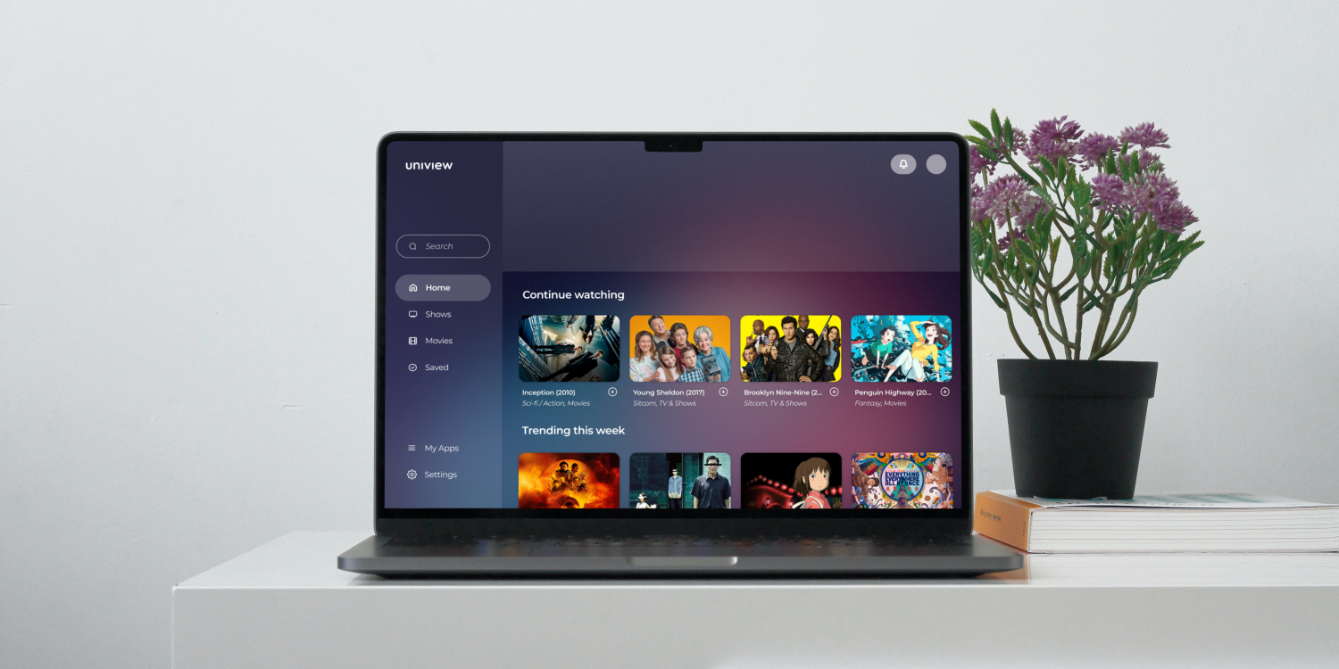
A desktop application that consolidates shows/movies across different streaming services into one place, making it easier to watch what you want to watch without the extra hassle.
👷♂️Role: UI/UX Designer
🕒Scope: 4 months (January 2024 – May 2024)
🛠️Tools: Figma, Pen & Paper
👥Team Size: Solo
© 2025 Andrew Liu
OVERVIEW
As more and more streaming services enter the market, subscribers have a harder time finding what they want to watch across different apps, needing to spend extra effort launching each service and searching through its various pages only to find that what they want to watch is no longer there. Uniview is a proposed solution to this issue – a consolidated streaming app that lets you connect all your other services and access their content in one place, saving you time so you can enjoy your favorite content with ease.

RESEARCH
I began the research phase of this project by conducting two in-person user interviews, as well as one over Zoom, to identify the strengths and weaknesses of existing streaming service apps. For all three participants, I asked the following questions:
- What apps do you use most often for streaming shows, movies, music, etc.?
- How would you describe your daily experience with these apps?
- What do you think could be fixed/easier to use in these apps?
- What role does digital media like shows, movies, and music have in your life?
- What features would you find most valuable in this new app?
Two participants stated that something they didn't like about the current streaming services they were using (Hulu, HBO Max, Netflix) — and something they would subsequently like to see fixed in this app — was that the recommendation algorithm didn't feel personalized enough. Another pain point was the need to keep track of different passwords across different apps. One participant noted that this was especially inconvenient because their family used shared accounts, which meant that passwords were frequently forgotten and changed.
All of the participants responded that a significant strength of their current streaming apps was the user interface. They liked how clean and simple the design was and stated that the minimalism made it easier for them to focus on the actual content they were browsing. This was something I noted to incorporate in my own design later on.
DESIGN
User Persona:
The design process started with consolidating some of the information I gathered during the research phase to create a user persona named Alex Markov. This persona consisted of personal information, like age and occupation, as well as activities & behaviors, goals & motivations, and pain points & frustrations, all of which were informed by the user interview responses.

User Flow:
After creating the user persona, I moved on to envisioning how the user would navigate through the app. This was a relatively straightforward step, as I adopted the flow of existing streaming services — first-time users are greeted with a landing page that gives them options for logging in or signing up, followed by basic onboarding, and then of course the primary app screens (dashboard, search, show/movie page, etc.).
Lo-fi Wireframes:
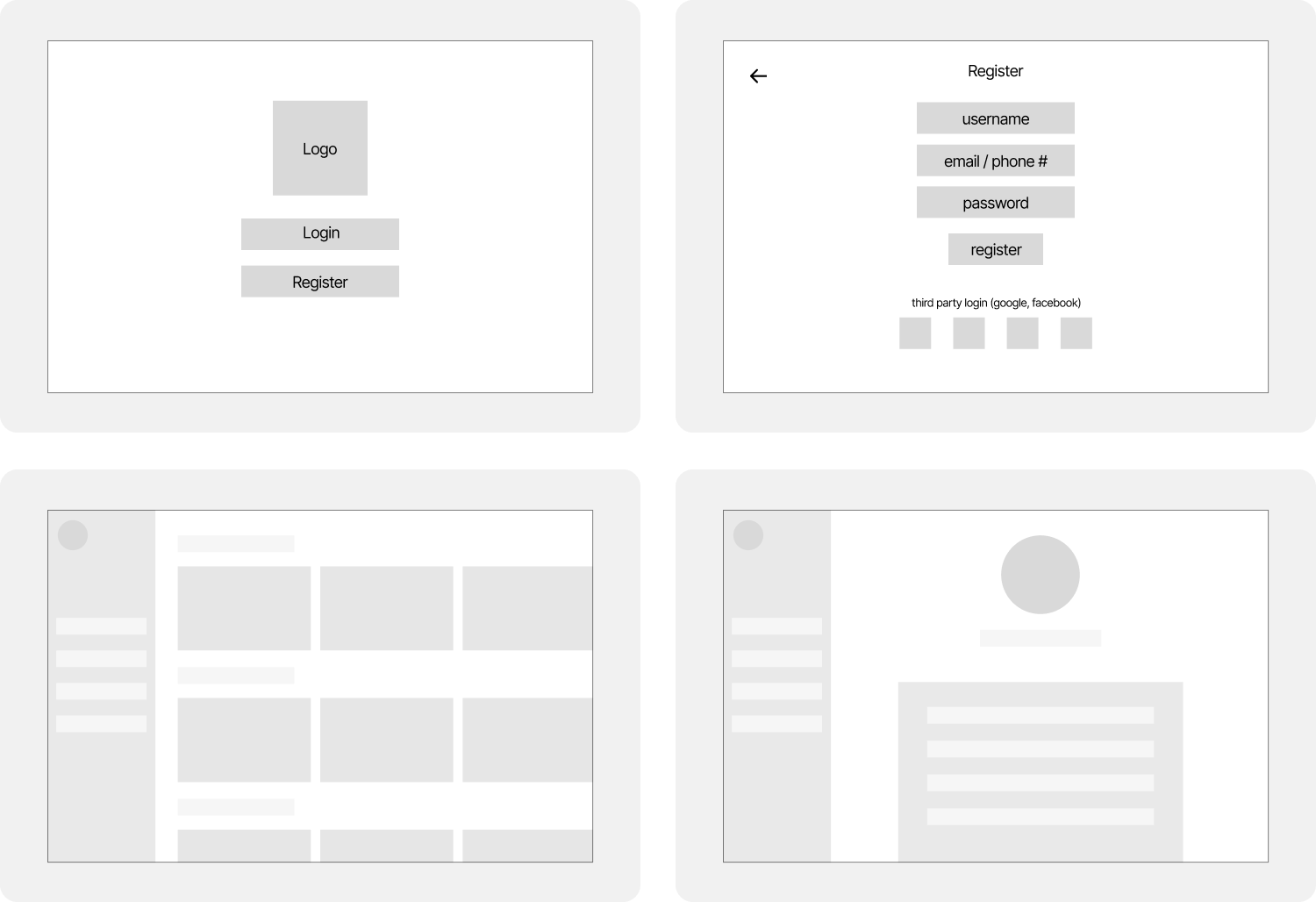
Before moving into hi-fi design, I created a set of lo-fi wireframes to generally map out the app's core flows and layouts. These sketches were notably rudimentary, especially in hindsight, but I was approaching the end of the semester and wanted to move into hi-fi prototyping — where I could better explore color, typography, and interface details — as soon as possible. Despite their minimalism, though, these basic wireframes were still helpful and a necessary stepping stone in converting the high-level site map into a real, functional user experience.

Hi-fi Wireframes:
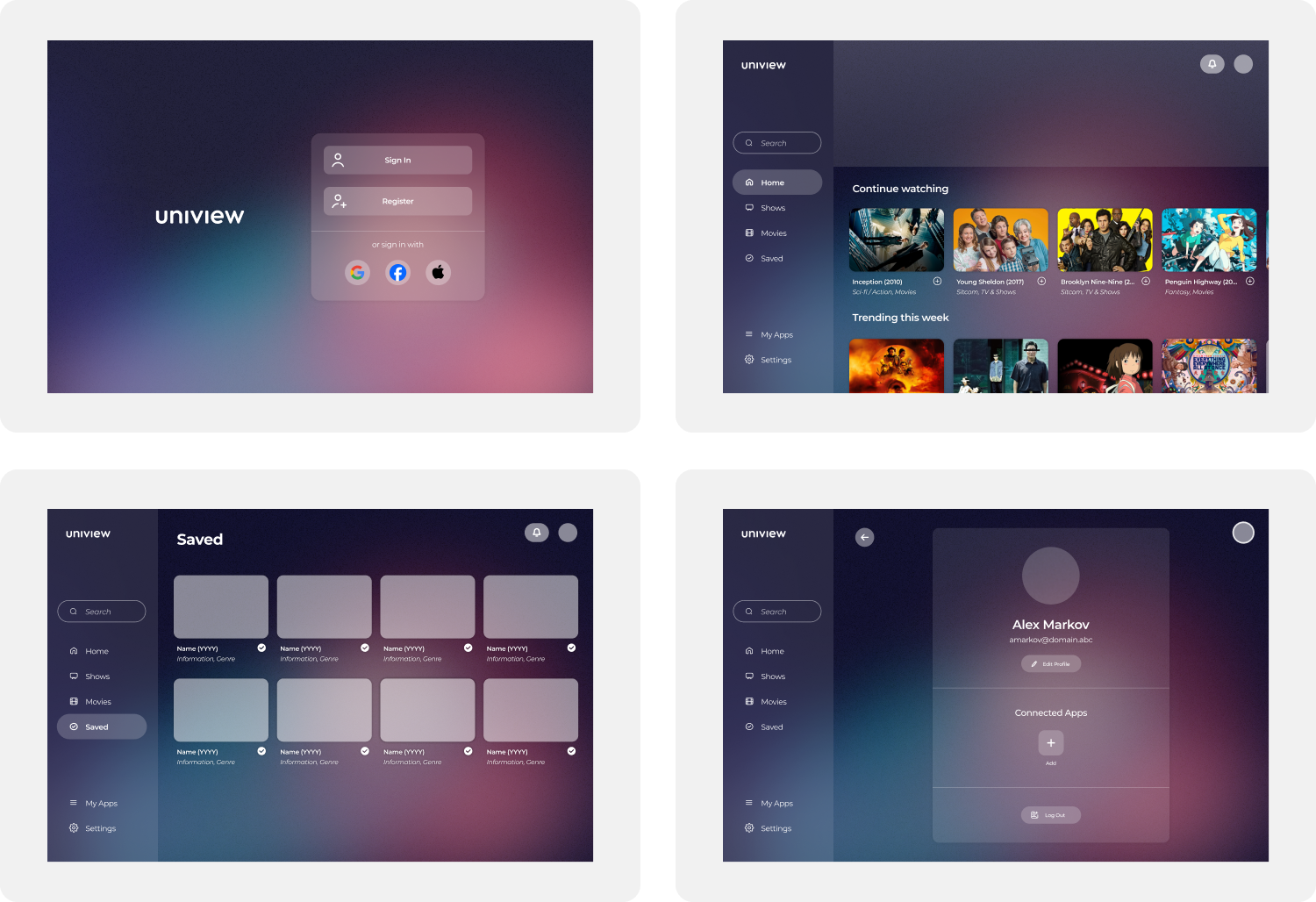
For the hi-fi designs, I took inspiration from the UI of Hulu and Spotify, two streaming services that were brought up in a couple of the initial user interviews as having a strong blend of simplicity and functionality. I wanted to achieve the same balance, so I went for a minimalist interface with as little visual clutter as possible that would highlight CTAs more clearly and intuitively.

A big focus of mine during this portion of the process was to ensure visual consistency between the different screens, which I felt would improve the overall experience of the app as it would make navigation easier and communicate a clear design language. I tried to take into account all of my user interview responses; while some were easier to implement into a design/prototype, like keeping the overall style and simplicity of other apps the users had used, others were more difficult or not possible at all (namely, an improved recommendation algorithm).
Additionally, I created a thorough library of reusable components in Figma that not only increased my productivity and made my life easier when working on different parts of the app, but also helped ensure pixel-perfect consistency between screens.
Prototype:
The last step before user testing was to link together the wireframes to create a functional prototype of the app. This included making all buttons clickable and linking them to their respective pages, creating a dropdown overlay for the notifications button, and most importantly, utilizing variables to allow for a mockup of connecting streaming services to Uniview.
Testing:
Once I was done with the initial prototype, I reached back out to the participants who I had interviewed at the beginning of the project to conduct user testing. Once again, two tests were performed in-person as I took notes of their responses to the tasks being asked of them, and one was done over Zoom, with the participant being asked to write down their thoughts and opinions after the completion (or lack thereof) of each task. I received the following feedback:
- Interface felt intuitive and familiar, with a clean, minimal layout.
- Content info pages (synopsis, cast, ratings) were clear and useful.
- Consolidated tabs like Movies, TV, Home, etc. made navigation simple.
- Adding streaming services was hard to find and unintuitive.
- Navigation gaps (e.g., no back button, cluttered search results) disrupted flow.
PROJECT TAKEAWAYS
This project was my first foray into the full design process that goes into creating user experiences. As such, I made a lot of mistakes along the way. Writing this now in September 2025 and looking back at the work I did, it's easy for me to identify numerous areas I could do better now (the color contrast of some of the buttons was… a choice). But I also learned so much from diving into this experience and allowing myself to make those mistakes. Some of my biggest takeaways from working on Uniview were:
Research: Prior to my work on this project, I thought of UI/UX design as being synonymous with graphic design. I didn't realize until starting the process that research was so important, not only for getting a better idea of the product you're creating but also for laying a solid and stable foundation upon which the visual design can then be built.
Process: One thing that was emphasized to me repeatedly throughout the four months I worked on Uniview was the importance of the five-stage design process, particularly the part about iteration and non-linear workflow. I came to realize as I worked how essential it was for me to return to what I had previously thought of as my MVP, because as I gained new insights and perspectives on the work I did, the more holes I found I needed to patch.
Usability: Usability issues (like difficulty finding the “connect apps” flow) showed how even the smallest navigation challenges can disrupt the overall experience for the user. These issues challenged me to reorient my perspective as I worked, as sometimes I found I would get so focused on small details that I would neglect to contextualize my designs in the rest of the experience.
