AdaptX
A mobile app that connects impaired athletes with support partners to make fitness more accessible, inclusive, and rewarding.
👷♂️Role: UI/UX Designer
🕒Scope: 4 months (January 2025 – May 2025)
🛠️Tools: Figma, Notion, Miro, Pen & Paper
👥Team Size: 4
© 2025 Andrew Liu
OVERVIEW
Athletes with impairments often struggle to find compatible guides and accessible events, while volunteers and organizers lack an easy way to connect. Our goal with this project was to create a location-based app that links impaired athletes with nearby guides, makes volunteering simple, and helps organizers manage inclusive events.
RESEARCH
To gather more information about the app's potential user base, particularly their accessibility needs and pain points they experienced with other fitness apps they had used before, our team designed a survey containing a mix of open-ended and multiple-choice questions and sent it out to a group of volunteers.
This is where we encountered our first challenge – we had sent the survey to an email list of 25 volunteers, and thus were expecting at least 10-15 responses. However, we ultimately closed out our research phase with only three responses.
While we were able to gain some valuable insights from our participants' answers, our team chose to continue our research through the beginning of the design phase by conducting user interviews over Zoom. I delegated this task to two of my teammates who were less comfortable designing in Figma to maximize our team's efficiency.
DESIGN
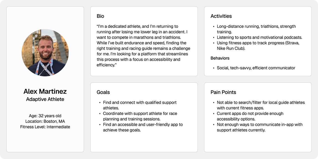
User Personas:
Our design process began with creating user personas and journey maps based on the research we had done. This step was crucial in determining the direction we would go with the app and helped us consolidate our work in the prior phase to be more digestible and tangible. Below is a persona our team created for the primary user type, adaptive athletes:
User Flows:
We followed up on our work with the personas and journey maps by translating the user stories we had created for each primary user type into detailed user flows. We used the requirements that our client gave us as a baseline for screens and features we needed to have (such as having a search and filter option to locate nearby athletes and organizations). From there, we added items like login, register, and onboarding, as well as key app features like the dashboard and settings screens.
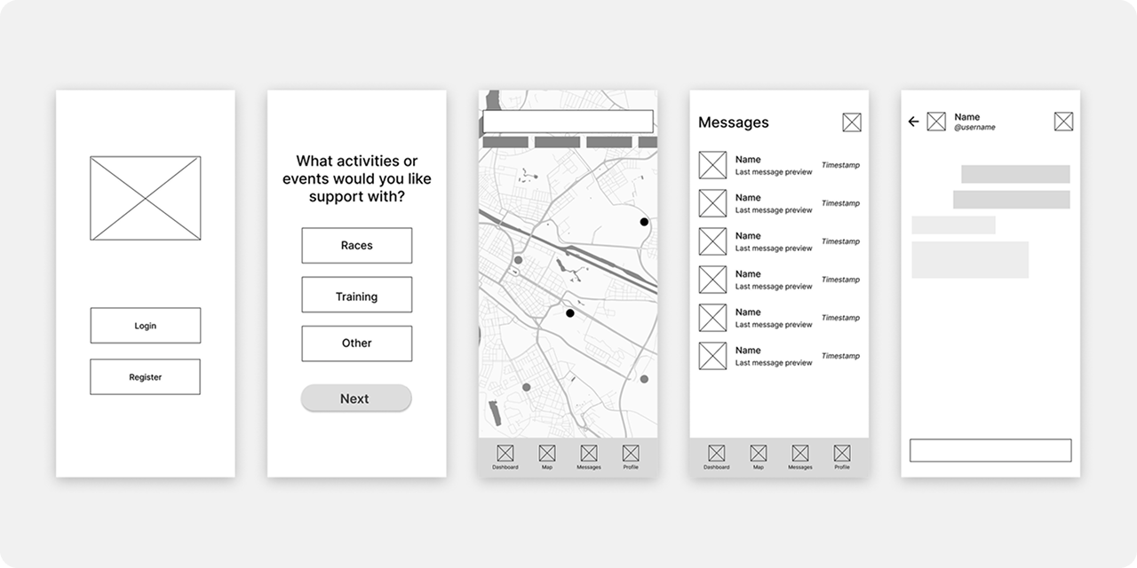
Lo-fi Wireframes:
Once we shared our work on the user flows with our project manager and client, we moved on to designing basic wireframes. Our first step during this part of the design phase was to meet up as a team and sketch ideas on a whiteboard for each of the screens present in the user flow graph. By collaborating in person, we were able to give feedback to each other in real time and thus expedited our work significantly.
Following this, we translated our hand-drawn designs into Figma as lo-fi wireframes. During this portion, we focused only on copying what we had worked on on the whiteboard, using basic shapes and text boxes to outline where headings, buttons, images, etc. would go. With this done, we were able to determine how each screen should look, which set us up nicely to move on to hi-fi wireframes.
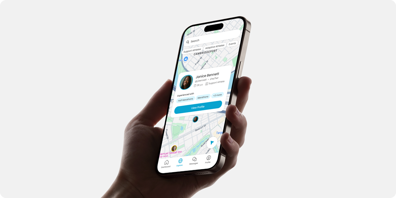
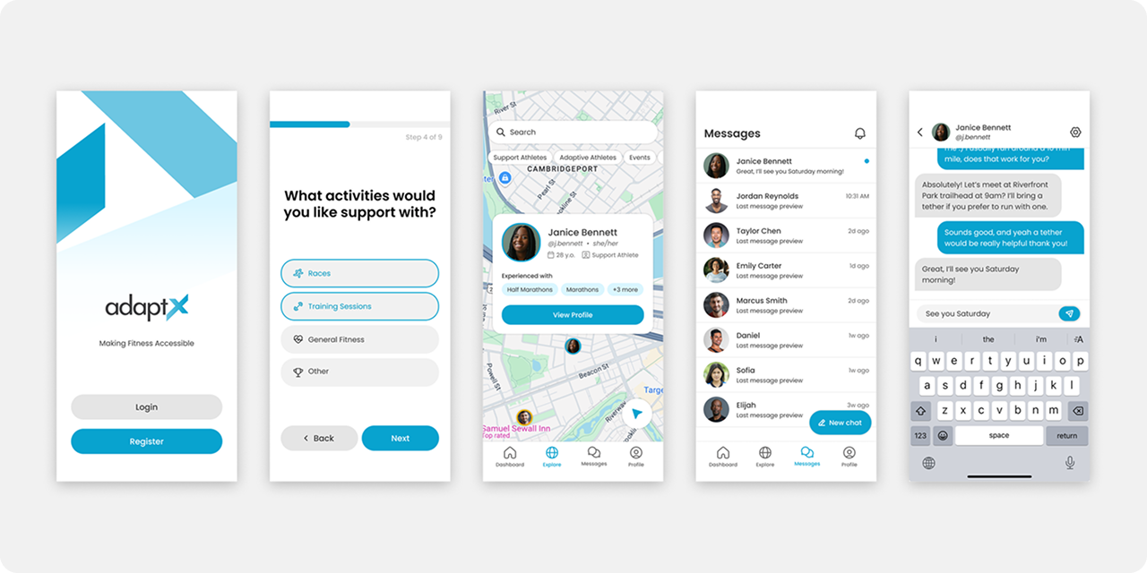
Hi-fi Wireframes:
The last month of the project was spent between fleshing out our hi-fi wireframes and prototyping. We took an iterative approach with designing the hi-fi screens, initially copying over the lo-fi designs and doing some basic styling (adding color, updating fonts, choosing iconography). From there, I created a library of custom components in Figma to ensure consistent design language across the app. This included buttons, cards, etc., all of which I created multiple variants of for different states (default, pressed, inactive) to make the user experience more tactile and reactive. At the end of the design phase, we had the final hi-fi wireframes you see below.
Prototype:
As my team and I were designing and improving the hi-fi wireframes, I began prototyping the various screens we finished, starting with basic navigation: tapping the 'Register' button would take you to the Register screen, and tapping the 'Back' button would… well, you get the idea. I set up some interactions between the states of the components I had designed, too, making it so tapping a button would change it to the 'pressed' variant. Finally, I included some basic gestures; swiping right on a nested screen would act as a back button and bring you back to the previous screen you were on, and dragging your finger would pan the map around like you would find on Google Maps.
Testing:
We concluded the project by conducting a 30-minute user test over Zoom, in which two of my teammates interviewed a participant – a digital accessibility expert who was completely blind – and walked them through our prototype. We received the following feedback:
- Keep all font sizes at least 14 px or more.
- Flag purely decorative icons so screen readers don't try to read them.
- Icons are helpful for people with cognitive disabilities to navigate easier.
- Generally, prototype and wireframes need to be more accessible.
PROJECT TAKEAWAYS
This project was an incredibly fun and valuable experience. It gave me my first experience working in a team environment as a UI/UX designer, which brought up a range of different challenges that I got to navigate and solve. It was also the first time I got to play more of a leadership role – being the member of the team with the most prior experience with design and Figma – which brought with it its own challenges and rewards.
One of the biggest lessons I took away from this experience is that the degree to which a product is accessible can make or break the user experience. This was the first time I had ever worked on an app whose primary user base consisted of individuals with physical and visual impairments. As such, my perception of "good UI" was challenged deeply throughout the four months my team and I worked on this project.